The Dress That Left Eyes Across Sydney Confused – Dr Daniel Polya explains
You’ve heard about “that dress” right? If not, its the dress that created a social media storm last week, that had people not just in Sydney, but all over the world, arguing the colour of the dress.
If you missed the saga dubbed “Dressgate” you can catch up here http://en.m.wikipedia.org/wiki/Dressgate and see the dress pictured below
We asked Sydney Ophthalmic Specialists’ retinal expert to weigh in with a “brief” explanation of why some people saw the dress as white and gold, whilst others were adamant it was in fact blue and black.
Here is Dr Daniel Polya’s expert opinion:
Our perception of the world is all relative and this applies to our perception of colour as well. This dress illustrates three interesting visual processing phenomena which have their cellular basis starting in the retina and continuing into the occipital cortex and beyond. The photo of the dress results in some people seeing the dress as blue and black while others will see it as white and gold. What is also interesting about this photo is that the dress can be perceived as gold and white if the upper portion of the dress is viewed which has a predominantly blue background in the photo and particularly if viewed against a blue screen saver or if viewed with more bluish light. Then if the lower part of the photo is viewed by scrolling down the screen so that the upper portion of the photo can no longer be viewed the dress can be seen as blue and black where the photo has a predominantly yellow background. By placing some yellow post-it notes around the picture there is an even greater chance of being able to see the dress as blue and black. Viewing under yellow halogen lights will also make the dress appear more blue.
So what is going on to explain this?
Firstly our perception of light is influenced by the colour of light that illuminates an object. In this photo there are cues that lead to more blue or to more yellow illumination. While the wavelength of light that is emitted from the photo is constant, the perception of colour is influenced by the background illumination. In ophthalmology, retinal specialists will often employ red free photography to increase the degree of contrast between red blood vessels which will appear black with this type of photography and the orange-brown layers of the retina. By manipulating the illumination this makes it much easier to see red vessels on an orange background in the eye.
Secondly, our higher visual processing centres help us see what we are expecting to see. For example the blindspot is a region corresponding to the optic nerve head where the retinal nerve fibres travel on their path to the brain. In this region there are no retinal photoreceptors to detect images yet our brain will spontaneously fill in these gaps so that we are unaware of this defect in our visual field. To map our blindspot it is relatively easy to look at the tip of a pen or a fingernail and hold this at arm’s length directly in front of you. Then while continuing to look straight ahead begin to move your pen tip or fingernail directly horizontally and once you have moved it around 7 degrees and you have reached your blindspot you will notice your pen tip or fingernail disappear. In the photo of the dress the cues that lead to white or blue perception of the dress are generalized by the brain to the entire dress as we are expecting to see a dress in one predominant colour.
Thirdly, we perceive things through the borders that are created when viewing the defining edges of objects. The contrast that exists at borders is enhanced by mechanisms in the retina and further up the visual processing system through what is called centre-surround lateral inhibition. Have you ever noticed that if you look at a shadow that the edge of the shadow is slightly darker than the body of the shadow? The same applies to a door frame, a chair leg, or any border. One edge of the border is perceived as slightly lighter than it actually is and one edge is perceived as slightly darker than it actually is. The cellular basis for this is mediated in part by the bipolar cells in the retina. When central “on” bipolar cells are stimulated in the retina by light, their connections to surrounding “off” bipolar cells lead to lateral inhibition of these cells which leads to a perception of increased contrast between the stimulating area and its surrounds. In the photo of the dress the same type of centre-surround on-off opponency in brightness perception also applies to colour perception for which blue and yellow are opponent colours.
The blue background at the top of the photo leads to less of a perception of blue in the dress and the dress is seen as being less blue than it actually is and more yellow. The horizontal bands through the dress accentuate this phenomenon by being further regions of centre surround lateral inhibition. The blue bands in the dress result in the adjacent bands being perceived as more yellow and when combined with the dress being overall perceived as less blue the dress appears yellow and white.
In the lower part of the photo, and especially if viewed under yellow lighting the predominant background yellow leads to the dress being perceived as more blue and less yellow. The yellow horizontal bands in the dress further accentuate this by increasing the intensity of the blue in the blue bands (the blue bands will increase the intensity of the yellow bands but due to the yellow background the overall perception of yellow is being inhibited).
Why is it that the colour inhibited area appears white in the white and gold dress and dark in the blue and black dress? Well, perception of light has 2 components: luminosity (brightness) and colour. It may be that the illumination in the photo had more blue light in it than yellow, so was effectively yellow free light and in this situation yellow will appear dark (due to a lack of yellow that is reflected from the yellow parts of the dress resulting in less bright light coming from this region) and blue areas will appear bright due to the larger number of blue photons being reflected from the dress (but not necessarily blue if the blue perception has been inhibited by the use of yellow background and yellow horizontal inhibitory bands in the dress)
Here is a link that discusses the dress and why different people may see it differently. It does not go into great detail other than to say that our perception is affected by the illumination but doesn’t explain why different people see different colours other than to say that some people are discounting the yellow in the picture to see a blue black dress and others are discounting the blue in the picture to see a white gold dress.
http://www.wired.com/2015/02/science-one-agrees-color-dress/
Dr Daniel Polya is Sydney Ophthalmic Specialists’ retinal specialist. To learn more about Dr Daniel Polya, please visit https://sosdoctors.com.au/our-doctors/
To book an appointment to get your eyes checked with Dr Daniel Polya at Sydney Ophthalmic Specialists please phone us on (02) 9241-2914.
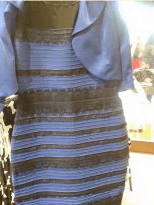
The dress at the centre of the colour debate